When we talk about branding, and logos, it is more than looking at colours, fonts, shape, and graphical elements. The logo communicates a lot more than a pretty, eye catching design. A good logo, communicates the core values and the message of this company. This great adweek article, talks in detail about the four core communication goals of a brand : the first is to communicate personality (friendly, fun, strong etc), the second is uniqueness, then there is currentness (i am with the times), and lastly it communicates that it knows it’s audience.
Very often clever designers leave a hidden meaning in the logo.
Adidas
Adidas has used multiple variants of a logo, all of which have three stripes
source : here
The lines in all logo versions represent an eternal movement straight ahead and toward the victory.
The variant most used looks like a mountain - that represents achievement.
This ..logo is supposed to resemble a mountain, like it is challenging the people who buy Adidas products to push themselves to their limits. This latest logo appears on many pieces of sports equipment and the new logo is still instantly and obviously “Adidas” to anyone who sees it.
Amazon
One of the most famous logos in the world, the amazon logo has a hidden meaning. The arrow moving from a to z, tell you the range of products that amazon has (from a to z), the yellow curved arrow represents the smile of customer satisfaction.
Dabur

Dabur is one of the best known health brands in India - focusing primarily on Ayurvedic medicines, and health supplements. The logo symbolises well being, and good health.
the burst of leaves and their colours in the new identity signify growth, rejuvenation and inner strength. The form and colour of the trunk convey growth, youthfulness and stability. Also, the Dabur font for the brand name has been changed,
Tata

One of oldest, most respected, and most identifiable brands in India,
The Tata logo stands for fluidity. It may also signify a fountain of knowledge, or a tree of trust under which people can seek shelter. The blue color in the emblem represents prosperity, reliability and strength.

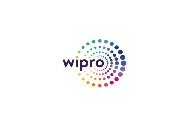
One of India’s most respected software companies, recently changed it’s logo. It’s new logo is a set of colourful dots. According to Wipro, this is what the logo symbolises
Building on the universal form of the circle, the radiating rings of dots around our Wipro name suggest all the many connections that our brand creates for our customers. Together, they convey a sense of outward motion, propelling us into the future that we define together. The colors of our brandmark also speak to our character – highlighting our reliability and authority.
